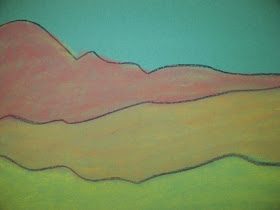
Second grade students learned about landscapes. We compared the landscapes of Joan Miro and Grant Wood as well as various other artists work. We discussed how they were alike and how they were different, the colors that the artists used, and then learned about the foreground, middleground and background in a landscape.
To begin, we practiced making a loose line in the air, waving our arms like music conductors. Then we practiced drawing our loose, organic lines on a piece of newsprint paper. Once our practice drawings were complete, we were ready to make our final drawings in pencil on top of colored construction paper. Colored paper adds more depth to pastel art work; another layer of color beneath the top colors that keeps our eyes seeing deeper into the work. I used lavendar, green, brown, pink and blue papers; a different color for each class. This made it easy to find which class the art work belonged to if a name or class code was missing.
After the final drawing was done in pencil, the students traced over their lines with a black crayon. We discussed color schemes. What are warm colors? What are cool colors? What kind of landscapes would have cool colors (the arctic, the ocean, snowy mountains) and what type would have warm (the desert, mountains in warm climates). The students then chose their color scheme and were instructed to choose the lightest color in their color scheme and color in their land, all three parts of it. Each student was given a paper towel to wrap around their fingers to use for blending their pastels on the paper. Once their first layer of color was blended, we discussed how to create shadows and light in our landscapes.
I demonstrated how to make a shadow by using one of the darker colors in their chosen color scheme, finding a low area in their lines and rubbing the pastel on it's side at an angle down to the next line. I told the students that anywhere there was a shadow on their mountain, right next to the shadow would be light. We talked about how the light came from the sun, and there are places where the sun cannot go, those places are dark, in the shadows. The places that were high on the land that the sun could get to, would be light. Anywhere there is a shadowy place on land, there would be a bright place right next to it. So, the students added the lightest color in their color scheme right next to the shadowy areas. Then they blended their colors. If they wanted to go back and add more color, they could.
Once the land was complete, I demonstrated how to make their sky. Some students chose to make blue skies, and some chose to make sunset skies. The results were gorgeous, as you can see!
The following is a step-by-step lesson you can use with your students:
Pastel Landscapes
1. Practice drawing loose lines on newsprint.
2. Make final drawing on colored paper and trace over pencil lines with black crayon. Review foreground, middleground and background.
3. Choose the lightest color in the colorscheme you chose for your landscape, and using the flat side of the pastel chalk (not the tip), rub the chalk across the paper filling in all of the land.
4. In the middleground, use the next darkest color in your color scheme to rub over the lightest color, and in the background use the darkest color to rub over the lightest color.
5. Blend with a paper towel or Kleenex.6. Add shadow areas; find low areas in your lines and beginning at that point, rub the darkest color on its side, at an angle, down the land area and stop at the black line. The darkest color would be the next darkest color up on the color wheel from the one that is on your paper. For warm color schemes it would go; yellow, orange, red and brown. For cool color schemes; light green, light blue, green, blue, violet.
7. Next, rub the lightest color in the color scheme right next to the shadow area.
8. Blend and go back over your work in places where you would like to add brighter light areas or darker shadowy areas.
9. Create your sky by choosing either cool colors for a warm landscape or warm colors for a cool landscape for the most visual contrast, or whatever you would like your sky to look like. First rub the main color of your sky over the entire sky area; for the above I blended dark blue and light blue.10. Add cloud by rubbing a white pastel on its side in a circular motion.
11. Add sunset colors over the horizon and blend into the sky if you would like.


No comments:
Post a Comment