Search Creating Art

Sunday, October 30, 2011

Variations on a Theme


      Pumpkins, Squash and Gourds!  When Fall arrived here in Texas, the only way we knew it was from the displays in the stores.  The trees did not turn, and it is only now getting cool out.  With the long drought we have had to suffer through and the 100+ days of 100+ temperatures, I was ready to usher in Fall!  By far my favorite season for the colors, the smells, the tastes, the temperature and the clothing!  It was time to bring Fall into the art room.  
     I purchased a large pumpkin and a bag of smaller squash and gourds.  A teacher friend, Judi, donated a bag of small pumpkins.  The students were amazed at the sight of the huge pumpkin and the tiny ones, the unusual textures of the squash and gourds.  I passed them around the room for the students to feel and describe before they would draw them.  Then I set them all up on a rolling cart in a still life with a beautiful complementary blue cloth below them.  We discussed the shapes, sizes lines and textures in the still life.  Proportion, overlapping and perspective were also discussed.
    K, 1st, 2nd and 5th grades all drew still lifes in different medias using different elements and principles of art.  Above I've shown three examples; a 5th grade value drawing, a 2nd grade oil pastel drawing and a 1st grade painted paper collage.  The painted paper collage idea I got from the wonderful Deep Space Sparkle sight.  This project was a big hit with beautiful results!  
    If you have any questions about how we went about these lessons, please message me and I'll be happy to share in more detail.  Happy Fall Y'all!!! 

Sunday, October 2, 2011

Color Scheme Portraits


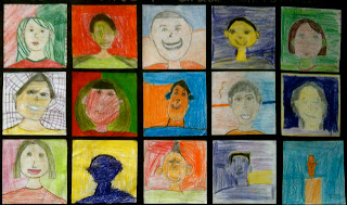
1st through 5th graders started off the school year by creating a self-portrait in an assigned color scheme. 1st grade: Primary colors, 2nd Grade: Secondary colors, 3rd Grade: Tertiary colors, 4th Grade: Complementary colors and 5th Grade: Analagous colors.  We began by a guided drawing of our faces, step-by-step.  I gave the students a mirror to see the shapes of their features and the lines of their hair and to discuss proportion.  There were lots of giggles at first (mainly with the little ones), as I told them to look in the mirror and say, "Hi Beautiful!" or "Hi Handsome!"  And they actually did it!  I love that they were having fun with their reflections and giving themselves a positive affirmation!  I demonstrated how to draw the different textures and styles of hair and eyeglasses, as well as how to add accessories, like headbands, earrings, etc. Finally, we discussed the color scheme their grade level would learn about through this project and how to color in their faces and features using non-traditional colors.  It was difficult for some of them to wrap their heads around using an odd color for their skin and hair, but I explained to them that these were in a pop-art style of bold, bright, unexpected colors.  These were meant to be fun portraits, not so much a serious photo realistic type portrait.  It was mainly the older kids that had more of a difficulty with sticking to the color schemes, the younger ones didn't seem to question it.  They were instructed to fill in the space of the paper with lots of color and pattern.   When they had completed the portraits, I made them into banners for their class to display in the hall outside of their classroom.

Saturday, October 1, 2011

Positive/Negative Hands


All I can say is, "WOW!!!" This project is- hands down- one of my very favorites!  The pictures do not do the actual work justice.  We filled the 4th grade hall with these hands and it is a feast for the eyes!  We learned about positive and negative space and cool and warm color schemes.
We started by making a background for our hands using Mr. Sketch watercolor markers on a 12" x 18" piece of white sulphite drawing paper.  I separated containers of them by color schemes, and the students had to choose if they were a "cool" or "warm" color scheme person.  Most students chose cool colors.  As you can see by the last example, the students drew "bursts" of radiating colors in concentric lines all over their paper.  Then they painted over their paper with clear water making sure to go off the edges of the paper.  The effects were amazing!  Most papers lost the initial drawing of the lines as the water worked it's magic, blending and gradating the color.  The students then traced their hands on a 9" x 12" piece of black paper.  I instructed them to make a small cut from the edge of the paper to the tip of their thumb to "get into" their hand and then cut around the contour line.  This was just meant to reduce frustration for them.  When the papers were glued down to the background, the cut becomes practically invisible.  They used their same color scheme to color in their hands and frame of hand with Prismacolor pencils.  I told them they could write (appropriate) words if they would like, patterns and designs and to, most importantly, express themselves!  I am giving them a huge virtual clap of my hands for a job well done!