Search Creating Art
Showing posts with label Drawing. Show all posts
Showing posts with label Drawing. Show all posts
Sunday, October 2, 2011
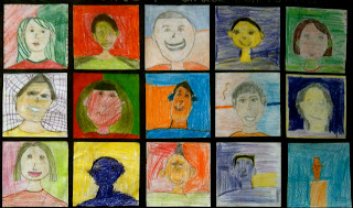
Color Scheme Portraits
1st through 5th graders started off the school year by creating a self-portrait in an assigned color scheme. 1st grade: Primary colors, 2nd Grade: Secondary colors, 3rd Grade: Tertiary colors, 4th Grade: Complementary colors and 5th Grade: Analagous colors. We began by a guided drawing of our faces, step-by-step. I gave the students a mirror to see the shapes of their features and the lines of their hair and to discuss proportion. There were lots of giggles at first (mainly with the little ones), as I told them to look in the mirror and say, "Hi Beautiful!" or "Hi Handsome!" And they actually did it! I love that they were having fun with their reflections and giving themselves a positive affirmation! I demonstrated how to draw the different textures and styles of hair and eyeglasses, as well as how to add accessories, like headbands, earrings, etc. Finally, we discussed the color scheme their grade level would learn about through this project and how to color in their faces and features using non-traditional colors. It was difficult for some of them to wrap their heads around using an odd color for their skin and hair, but I explained to them that these were in a pop-art style of bold, bright, unexpected colors. These were meant to be fun portraits, not so much a serious photo realistic type portrait. It was mainly the older kids that had more of a difficulty with sticking to the color schemes, the younger ones didn't seem to question it. They were instructed to fill in the space of the paper with lots of color and pattern. When they had completed the portraits, I made them into banners for their class to display in the hall outside of their classroom.
Saturday, October 1, 2011
Positive/Negative Hands
All I can say is, "WOW!!!" This project is- hands down- one of my very favorites! The pictures do not do the actual work justice. We filled the 4th grade hall with these hands and it is a feast for the eyes! We learned about positive and negative space and cool and warm color schemes.
We started by making a background for our hands using Mr. Sketch watercolor markers on a 12" x 18" piece of white sulphite drawing paper. I separated containers of them by color schemes, and the students had to choose if they were a "cool" or "warm" color scheme person. Most students chose cool colors. As you can see by the last example, the students drew "bursts" of radiating colors in concentric lines all over their paper. Then they painted over their paper with clear water making sure to go off the edges of the paper. The effects were amazing! Most papers lost the initial drawing of the lines as the water worked it's magic, blending and gradating the color. The students then traced their hands on a 9" x 12" piece of black paper. I instructed them to make a small cut from the edge of the paper to the tip of their thumb to "get into" their hand and then cut around the contour line. This was just meant to reduce frustration for them. When the papers were glued down to the background, the cut becomes practically invisible. They used their same color scheme to color in their hands and frame of hand with Prismacolor pencils. I told them they could write (appropriate) words if they would like, patterns and designs and to, most importantly, express themselves! I am giving them a huge virtual clap of my hands for a job well done!
Labels:
4th Grade,
Drawing,
Mixed Media,
Positive/Negative Space,
Watercolors
Saturday, May 21, 2011
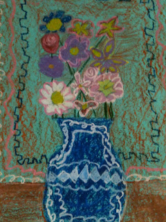
3rd Grade Flowers in Vases
3rd Graders took some very creative approaches to this project of drawing flowers in a vase. I love doing a project like this one with my students because they have so many options and choices with the subject matter and the colors they use. Oil pastels make these especially bright and colorful on colored construction paper. I like the depth that starting out with a colored paper brings the art work. The students have their choice of paper color, then we look at pictures of real flowers and discuss the different lines and shapes that make each flower look the way it does. I demonstrate how to draw the vase on the paper by explaining that the vases take up almost all of the lower half of the paper, while the flowers take up the whole upper half...filling the space on the paper is very important. I show them how they can begin with a line that will be top of their vase and line that will be the bottom. They can draw any kind of line on the side of the vase, then make one that is reflective of that on the other side. This can be the most difficult part for some students. I tell them to be as creative as they would like with their vases! We draw a horizon line that will indicate our table. Then I demonstrate how to draw some of the different blooms on the flowers. I tell them to use a variety of different blooms, in different shapes and sizes. I explain that variety is one of the principles of design and it adds interest to their art work. I tell the students to save their stems for last, and I show them how to draw a line from their bloom to the top of the vase, stopping and starting around other blooms to make them overlap.
After they have completed their pencil drawing, it is time to color in their work with oil pastels. I demonstrate how they can rub the oil pastels on their sides for coloring in large areas, and how to use the tip for smaller, detailed areas. I show them how to blend colors together and how to add dimension to their flowers and vases. The students really enjoy using the oil pastels, even though they can be so messy. I always tell them to not rest their hands on their work, or wipe over their work with their hands, because the pastels will smear easily and make prints on their paper where they don't want them. They can use paper towels to rest their hands on while coloring if they like. Each picture is so uniquely the students' own vision and creative interpretation. Choices are so important when teaching students art. The more the better! This builds confidence, self-esteem, and pride in one's own work. It is wonderful, too, when students can compliment one another on how they did something different and what a good choice they made. How affirming is that?! When our peers can lift us up for making a unique choice and not going along with the crowd? These are the real lessons we are learning in art.
Friday, April 15, 2011
Oil Pastel Dogs Inspired by George Rodrigue's "Blue Dog" Series
4th graders learned about the legend of Blue Dog and how artist George Rodrigue came to paint this subject over and over again. We looked at some of his paintings and read a short bio on him. Then students followed along as I demonstrated how to draw the contour line of their dogs. Once their lines were drawn, students traced over them with a black permanent marker. They could choose to color in their dogs with any color, but whatever color they chose (be it warm or cool), they were instructed to choose the opposite color family for their background. Some students veered from those instructions, but the ones that followed them had eye-popping results. All of their dogs turned out gorgeous and they had so much fun using the oil pastels and creating their unusually bright and colorful canines!
Sunday, February 6, 2011
Bodies in Motion!
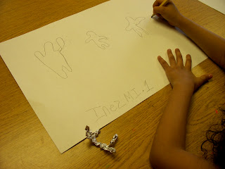
1st Graders learned in art class about how their bodies move, with the joints that bend us and allow us to redirect ourselves in a myriad of ways. We looked at art work by Edgar Degas (his ballerinas), Keith Harrings' wonderful street art of simplified figures moving and dancing, and African American Folk artist Jacob Lawrence, who did many paintings depicting the expression and emotion of the human body. I asked the students what they noticed about the way the people in the paintings were positioned, and how it made them feel to look them. What did they think the people in the paintings were feeling? They said, "Excited!", "Happy!", and one student said,"Tired" when they looked at Degas ballerinas. I imagine those ballerinas were tired. I asked them if they thought the artists asked the people they painted to lay down on a canvas so they could trace them. They all knew that an artist wouldn't do that. Because an artist that paints people and animals needs to understand the way our bodies move, how our joints bend, and what positions we can get into and which ones we can't. We talked about the fact that our elbows and knees can only bend one way, and we all got out of our seats to try to bend our limbs as many ways as we could! We found that we could bend backwards and forwards, from side to side, our head, feet and hands could bend the same.
So, after we made some funny looking poses, I showed the students how they could make a foil figure that they could bend like a real person. This was a trick I learned at a summer art conference at the museum. First, take a piece of foil (about 4" x 6") and make two tears, about 2" long, evenly space apart at the top of the piece as it stands vertically long. Then make one tear up the center, about 2", so that there is foil in the center that is not torn (this will be the torso). Next, scrunch up (I know, this is highly technical terminology) the foil at the top into three sections, being careful to keep their length (in other words, don't fold it over or ball it up). The center piece of foil will be the head (this can be balled up slightly to make it look like a head shape). The two bottom pieces are scrunched up next to make the legs, then finally, the center is scrunched together to make the torso. I told the students that they couldn't trace their foil figures-remember, a REAL artist would NEVER do that! I demonstrated how they could bend it in as many ways as they wanted (being careful not to bend it unrealistically), and look at their figure, studying the lines that it made in order to make a contour drawing of it. And by George, they got it! I couldn't believe my own eyes! 1st graders making wonderful contour drawings of the body in motion! They made them standing on their heads, doing back flips, the splits, jumping in the air- they told me what their figures were feeling- "Mrs. Gallow, my person is so happy because they got an A on their schoolwork!" They absolutely LOVED their foil people and wanted to take them home. This was a two part project, so we needed to keep them to help us with completing our art the second class. I paper clipped them to their work as I put it up. But, I told them, ask your mom or dad for a piece of foil from the kitchen and show them what you can do. Make one at home and practice your drawings of people moving. They will be amazed! The second art class they could take them home.
Finally, after their contour drawings were done in pencil, I had the students trace them with a sharpie and color them in with colored markers. I encouraged them to make more concentric lines going around their contour figures and to get creative with what types of lines and designs they could add to their artwork. The drawings are electric with energy and so much fun! I think that my art students, in first grade, are well on their way to understanding how to draw a person in motion... I can only imagine what their going to be able to do by 5th grade!
Monday, November 8, 2010
Kindergarten Miro's
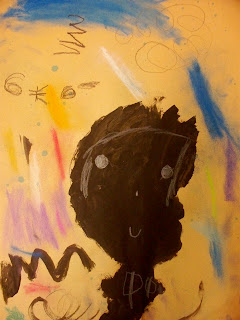
Kindergarteners learned about the art of Joan Miro. His work lends itself so well to elementary art and children seem to really respond to Miro's style. We talked about the way Miro used symbols instead of making his work look "real". Each student saw something different in his work, but, to my surprise, there was always one student in each class who thought the above picture looked like a bumble bee! I gave each of them a sheet of 12" x 18" tan construction paper and a big, fat, black crayon. I told them to stretch their arms out so that their drawing hands rested at the top of their papers. Then, with their eyes closed, to draw a big circle. I didn't want them to look at their papers, because it seems when they do, they think so hard about making the "perfect" circle, their circles come out tight and small. I wanted them to be very organic shapes, like Miro's. Next, they were instructed to draw a shape for their body and then add arms and legs- as many as they wanted. Some students did more than one figure on their paper. We observed the various lines and shapes Miro made in his work, and I instructed the students to decorate their papers with these symbols, or to make up their own. Students then painted inside their figures with black tempera paint. In our next art class, students added details on top of their figures with white crayons, and further embellished their art work with chalk pastels and a few spritz's of watercolor spray. I told the students I thought Miro was smiling on us and that he would be really proud of their work!
Subscribe to:
Posts (Atom)


